Project Scope
Logo Design
Graphic Design
Illustration
Role
Independent Designer
Timeline
3 weeks
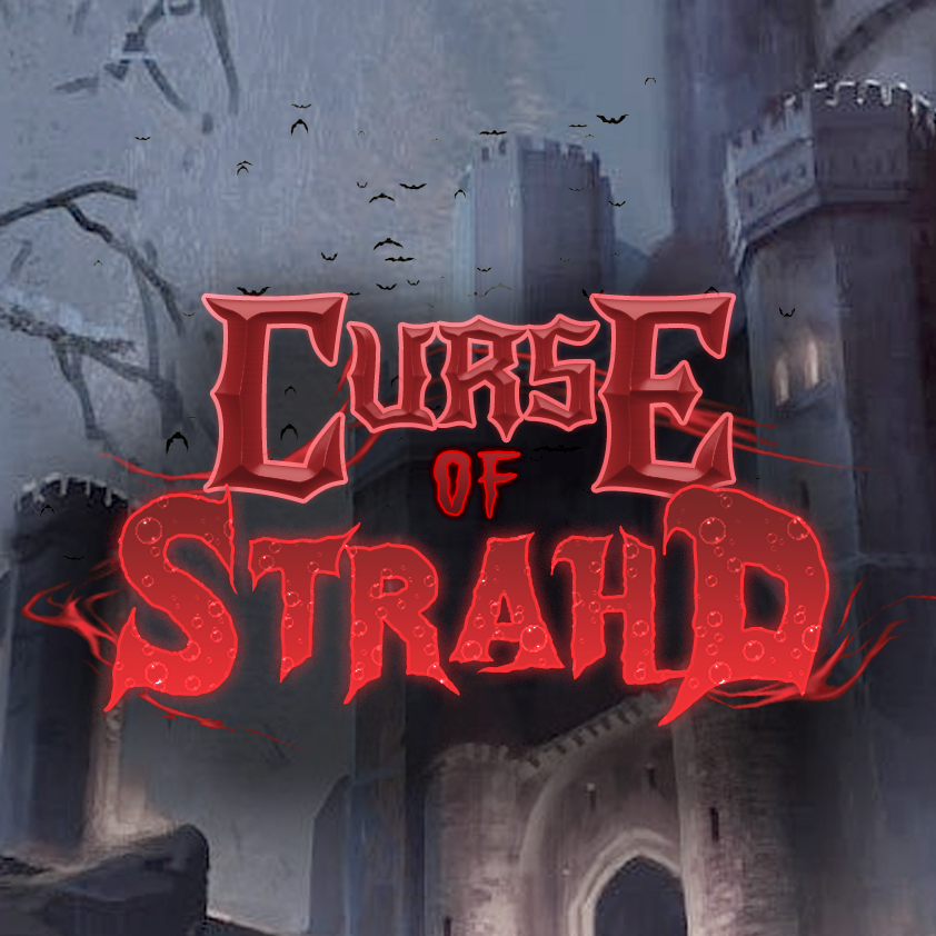
This was a personal fan design project created for the Dungeons & Dragons tabletop campaign Curse of Strahd, a gothic horror module set in the world of Barovia. The goal was to create a cohesive visual “brand” that enhanced immersion and roleplay for players through tactile props, digital and web-based designs, and printed materials.
⚠️Disclaimer: Some assets are sourced from Blizzard Entertainment. All rights belong to Blizzard Entertainment. This is an unofficial fan project.
Deliverables included:
✅ A logo for digital use, stickers, and handouts
✅ A printable Player’s Guidebook PDF
✅ 3D props (for maximum gameplay immersion)
✅ Various reusable graphic elements
Mood Board
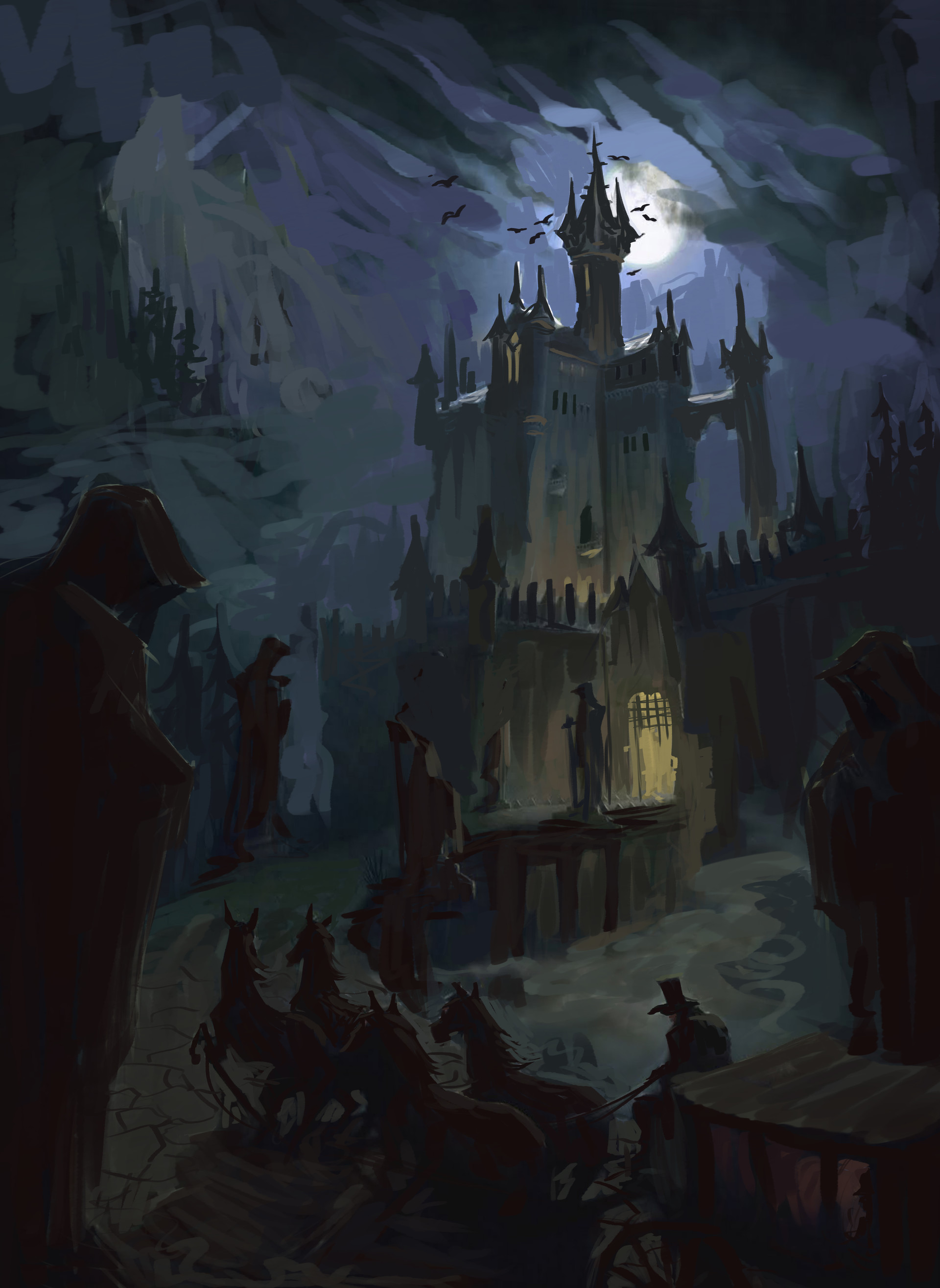
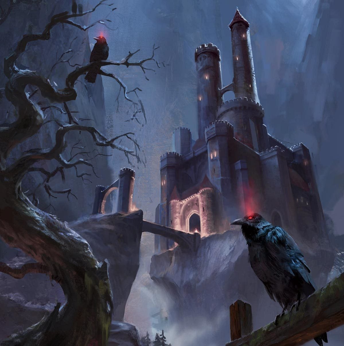
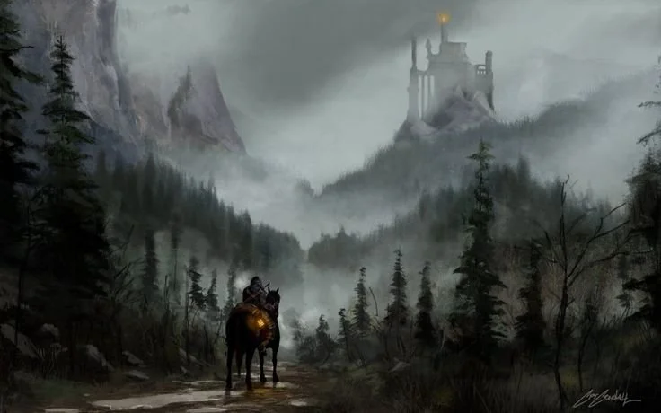
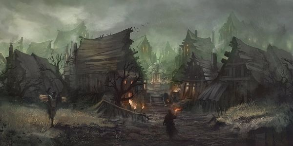
Before beginning production, I researched the Curse of Strahd setting to understand the tone, lore, and environmental design of Barovia. I translated this research into a curated mood board that established the project’s visual language, capturing the dark gothic atmosphere and environmental storytelling that define the world.
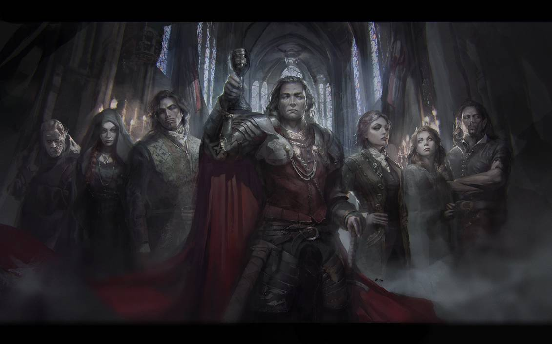
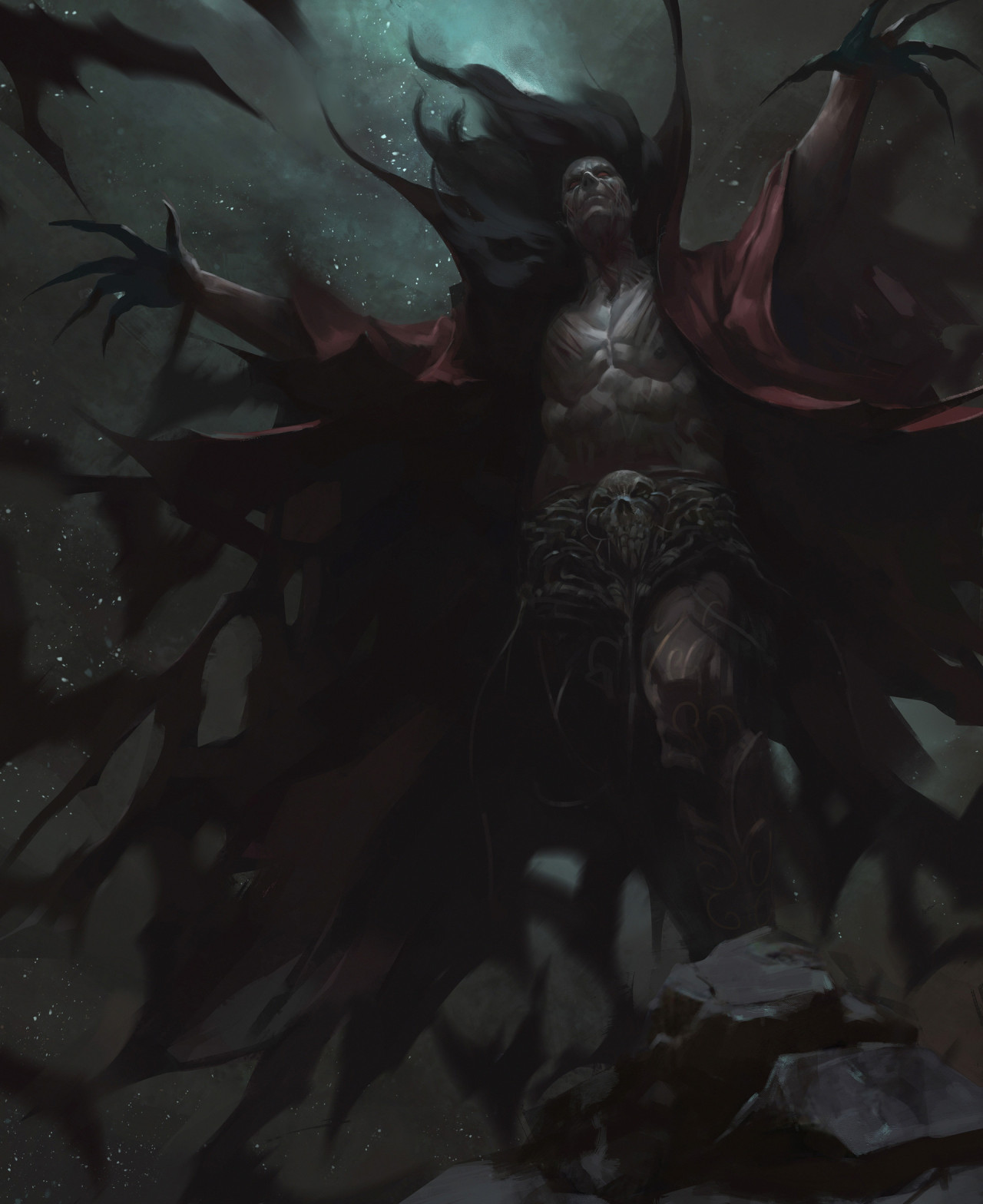
Towering gothic spires, mist-choked forests, overgrown graveyards, and desolate Transylvanian villages define the world of Barovia: a setting steeped in romantic gothic atmosphere and shaped by the same dark folklore that inspired Dracula by Bram Stoker.
As I curated references, several key visual principles emerged that informed my designs:
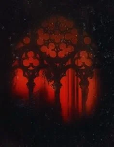
Heavy use of negative space
Muted, desaturated color palettes
Strong, razor-sharp silhouettes
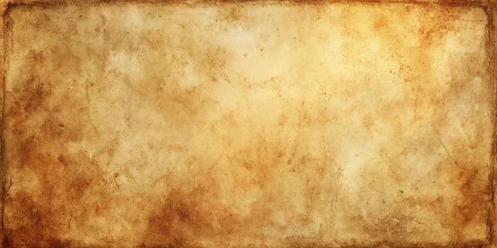
I also collected detailed references for in-world props (aged parchment textures, stamped wax seals, and book pages filled with ornate marginalia) to guide the creation of a cohesive and immersive Player’s Guidebook (see below).
Color Scheme
Red might seem like the obvious choice for a vampire-themed horror adventure, but I wanted to challenge myself and avoid simply throwing “blood” on everything and calling it a day. I thought about The Shining where Stanley Kubrick intentionally uses red sparingly throughout the film to signal danger or violence. I adopted a similar approach, reserving the color for moments of heightened tension and visual emphasis.
The primary palette relies on dull, muted brown-greys to reflect the harsh, desolate atmosphere of Barovia. Against this subdued backdrop, the rare, deliberate appearances of red become the brightest notes in the composition, drawing the viewer’s eye to key elements and reinforcing their importance.
Subtle hints of blue in the background suggest the mysterious mists that blanket the land, adding a cool undertone that enhances the setting’s sense of isolation and supernatural unease.
Logo Design
I decided the project needed a distinctive logo, something that would immediately signal Curse of Strahd and capture the essence of its dark, oppressive atmosphere at a glance. The goal was to create a symbol that feels bold, menacing, and instantly memorable.
I chose sharp, gothic-inspired typefaces and distorted fonts with with eroded edges to give the lettering a weathered, sinister quality. Superimposed bubbles and streaks of crimson energy suggest blood and dark power, reinforcing the campaign’s themes of vampirism and magic.
The raven icon set into the top bar strengthens the visual identity, alluding to the looming presence of Castle Ravenloft and the domain it commands.
I developed multiple variations of this logo for use across different formats, including social media avatars, favicons, stickers, labels, brochures, and printed handouts—maintaining a cohesive visual identity at every point of the project.
Both the mockup (left) and the final design (right) were created using Adobe Photoshop.
A 1:1 aspect avatar for Discord and social media (left), and a favicon version of the logo (right).
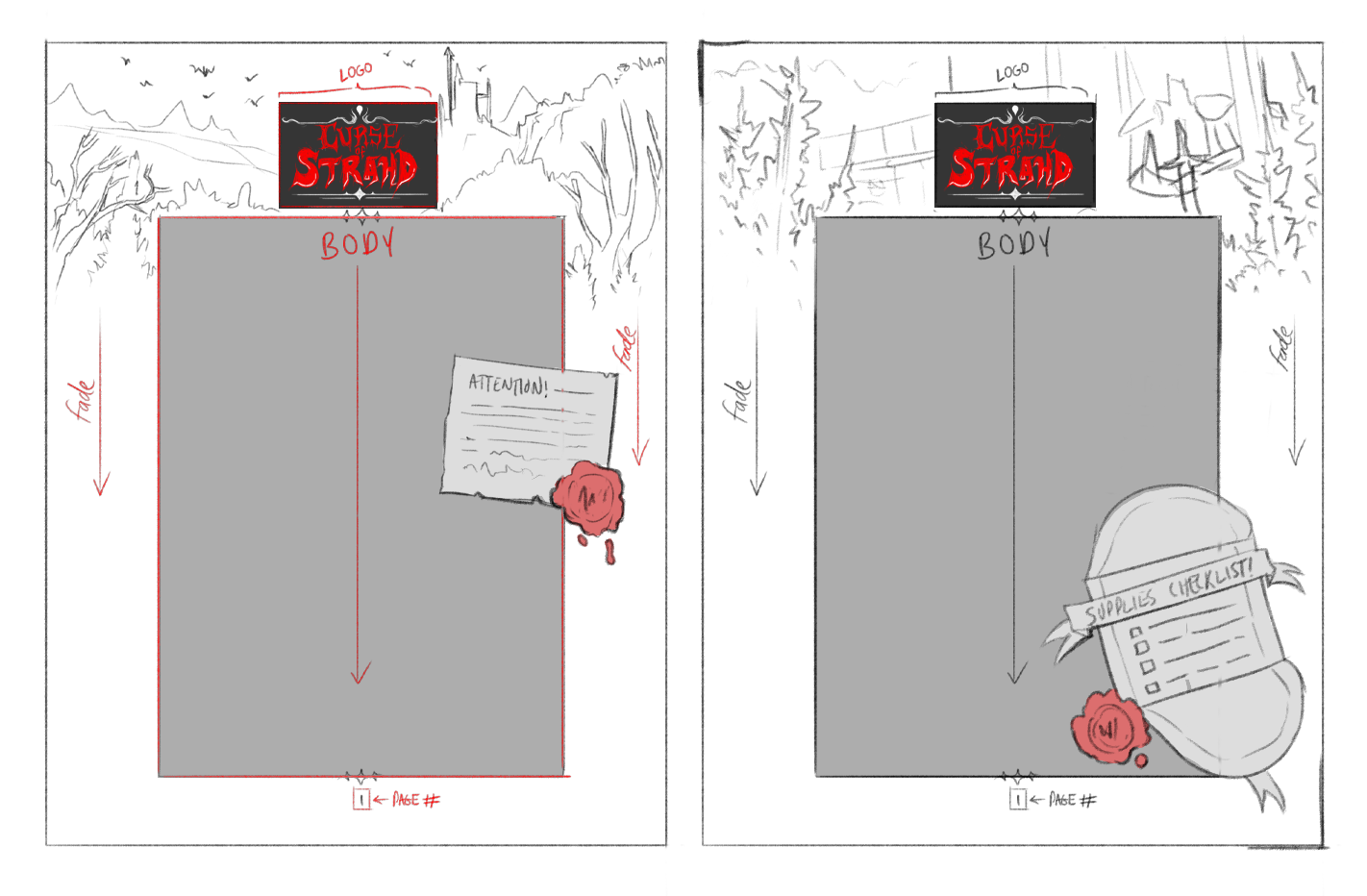
Player’s Guidebook Layout
I created these mock-up sketches to organize the layout for the Player’s Guidebook—a printable PDF designed to present essential information in a single, descriptive document. The goal was to offer just a taste of the story without revealing too much, provide all necessary details in a format that can be quickly referenced, and maintain a polished, professional presentation.
I drew inspiration from the RPG strategy guides I collected as a kid, along with vampire films and related media, to develop a schematic that feels immersive—as though you’ve just opened a page from an old, dusty spellbook.
The main body text uses strict formatting rules and crisp, legible typefaces, contained within a large central panel to reinforce visual hierarchy and ensure the most important information stands out. Extra wide outer margins allow picturesque background imagery to peek through at the top, while small note cards, letters, and sidebar elements break up the layout’s uniformity and add a bit of atmospheric flavour.
Player’s Guidebook
Each player received a printed copy of the two-page handout, along with a link to a digital PDF version for easy reference.
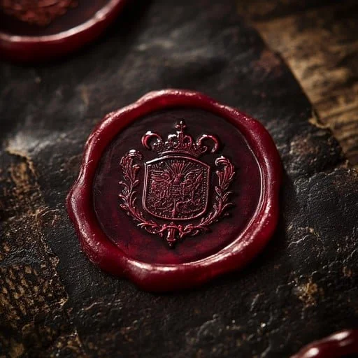
To reinforce the setting’s ancient mystique, I selected textures reminiscent of worn parchment, weathered stone, and scaled surfaces, lending the layout an ancient, fantastical character. Official Curse of Strahd artwork anchors each background, while the wax seal and open letter function as an elegant invitation, beckoning the reader into the world.
Key rules and terms are highlighted in bold to help readers quickly scan the material and locate essential information.
Careful contrast adjustments ensure the colors remain vivid and crisp and the text fully legible, whether viewed on screen or in print.
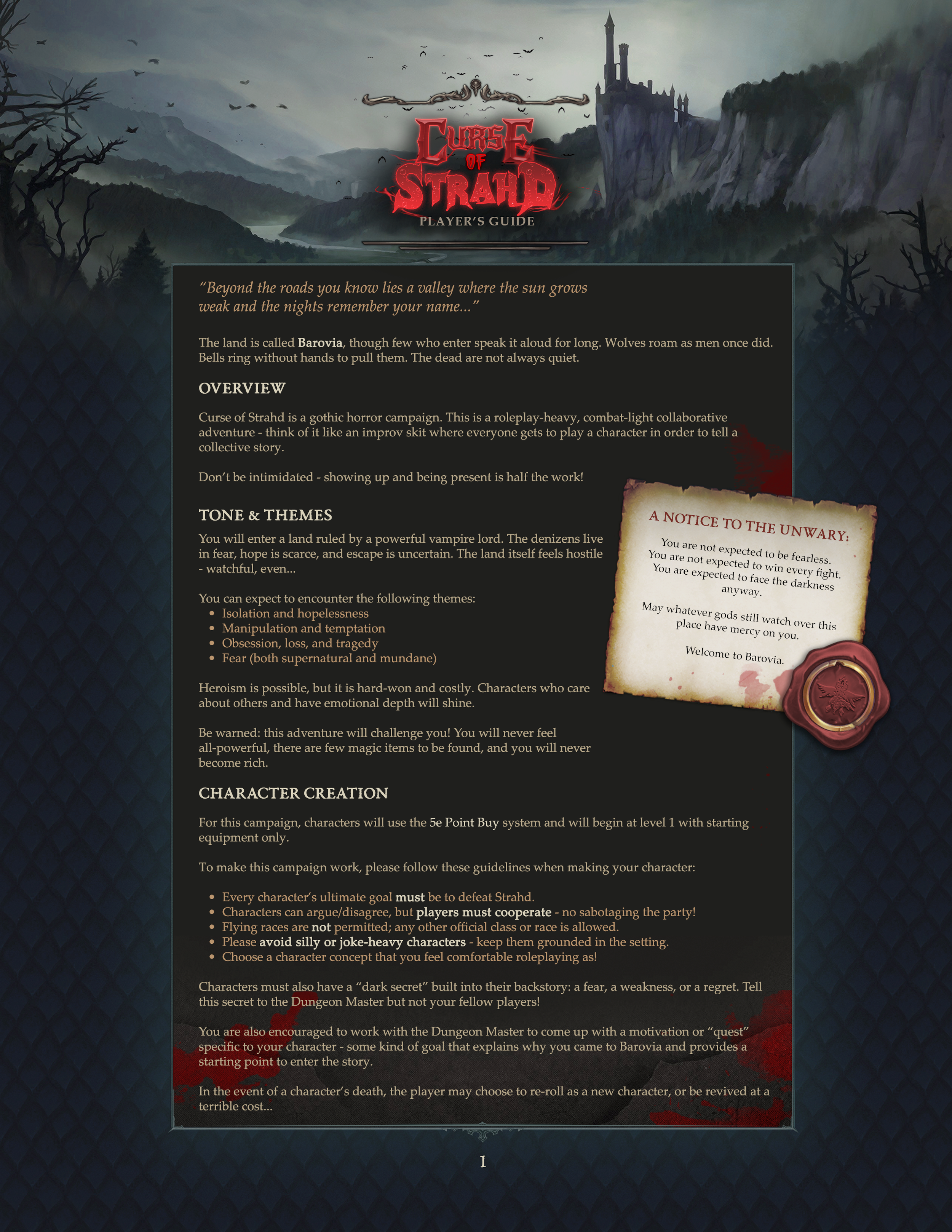
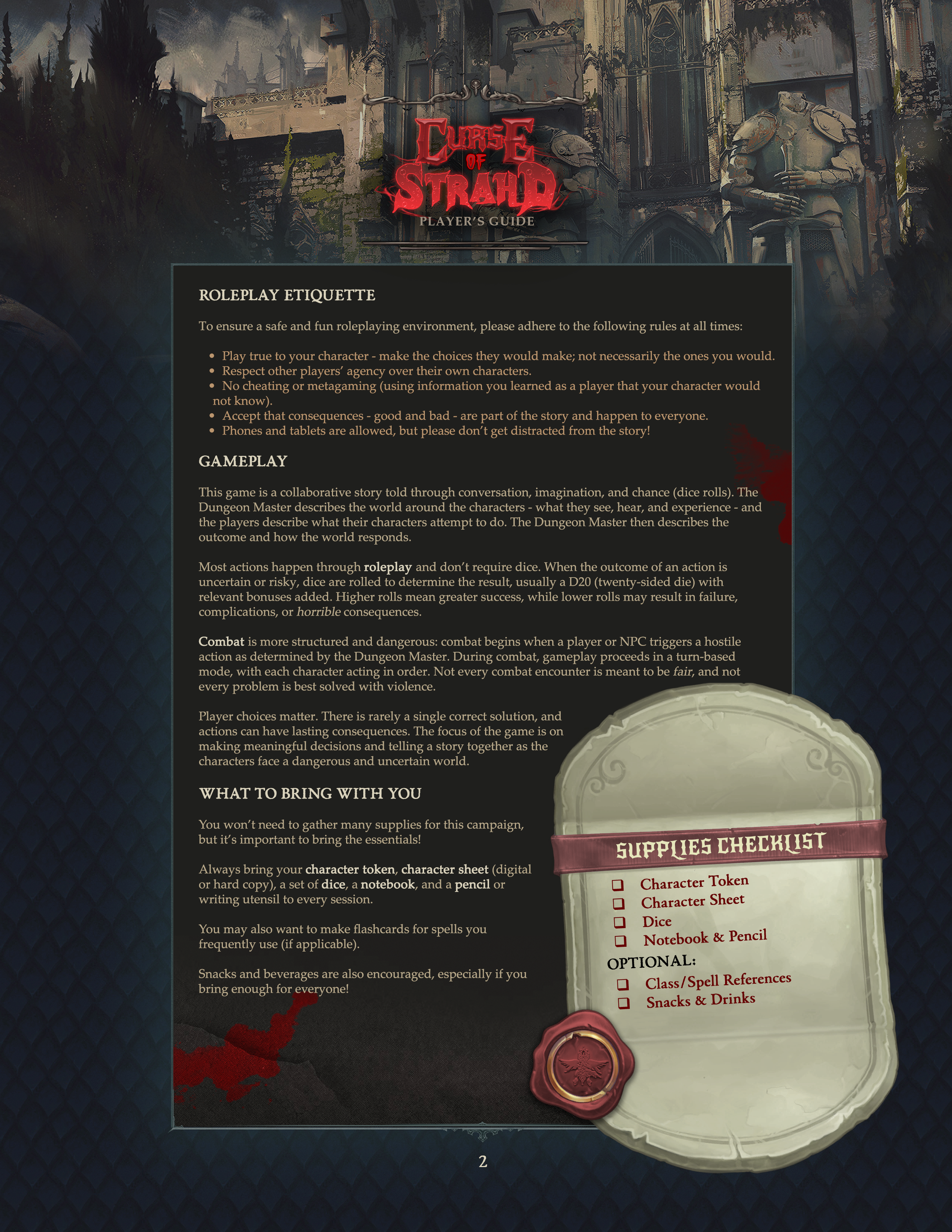
Background artwork sourced from Curse of Strahd (© Wizards of the Coast). Used here for portfolio demonstration purposes only. All rights belong to their respective owners.
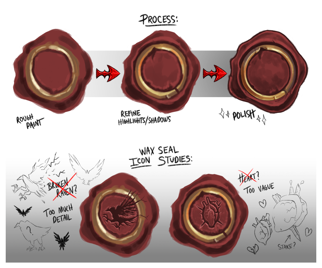
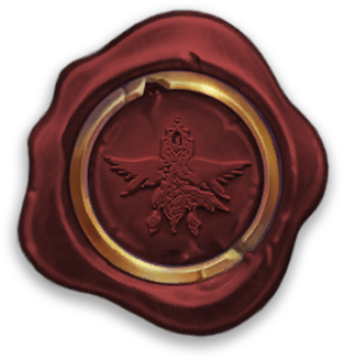
Creating the Wax Seal
A reference image of a richly textured red wax seal inspired me to create a custom version for the guidebook. I began with a rough digital sketch in Photoshop, refining the silhouette and increasing contrast to emphasize depth and dimension. As I sharpened the highlights and shadows, the seal developed a stylized, hand-painted quality that felt tactile and convincingly pressed onto the page.
After experimenting with several icon concepts, I chose to use the official crest of Strahd’s family rather than redesign it. I converted a vector of the crest into an embossed treatment and superimposed it onto the wax surface so the details would appear to catch the light naturally.
Like the logo, the finished seal became a versatile, reusable asset that helps maintain visual consistency across the project’s materials.
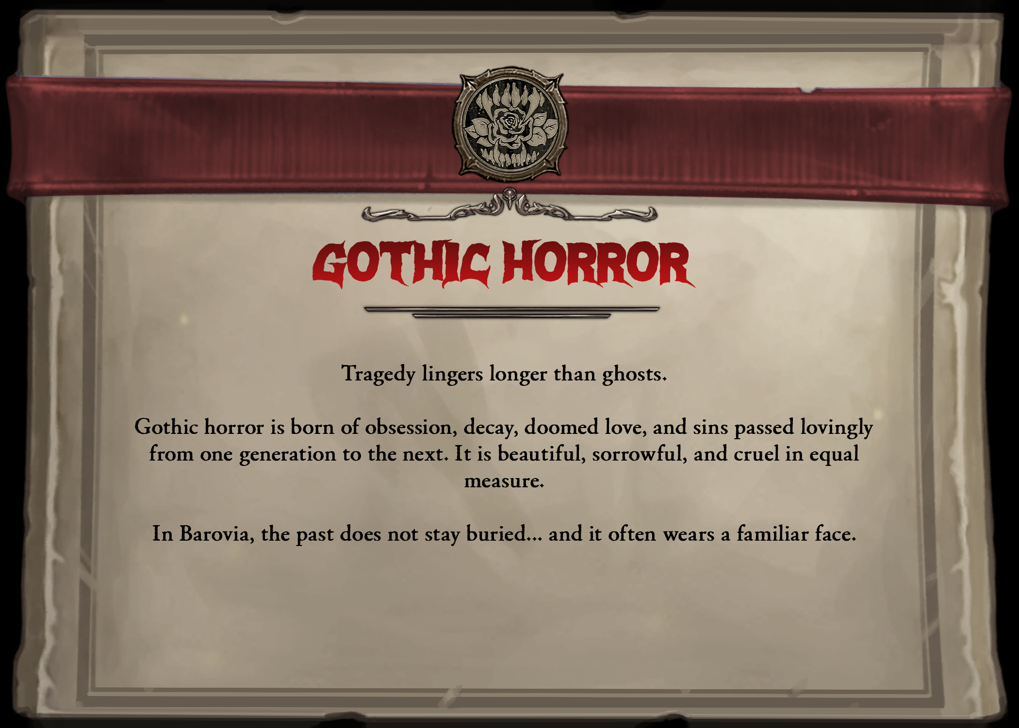
Horrors of Barovia Info Cards
As an added layer of fun, players were asked to choose one of four 5×7” information cards based solely on the icons displayed at the top of each design. Each printed card represents one of the Horrors of Barovia - a distinct horror subgenre described in Van Richten’s Guide to Ravenloft, a supplement for Curse of Strahd.
A given player’s selection determines the tone of the encounters, creatures, and other nightmares they will face throughout the story.
Designed to resemble postcards or handwritten letters, the cards reuse visual elements from the Player’s Guidebook above to maintain stylistic consistency and reinforce the project’s cohesive aesthetic.
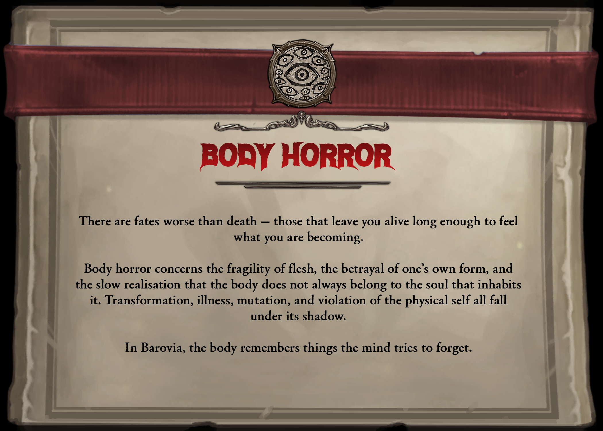
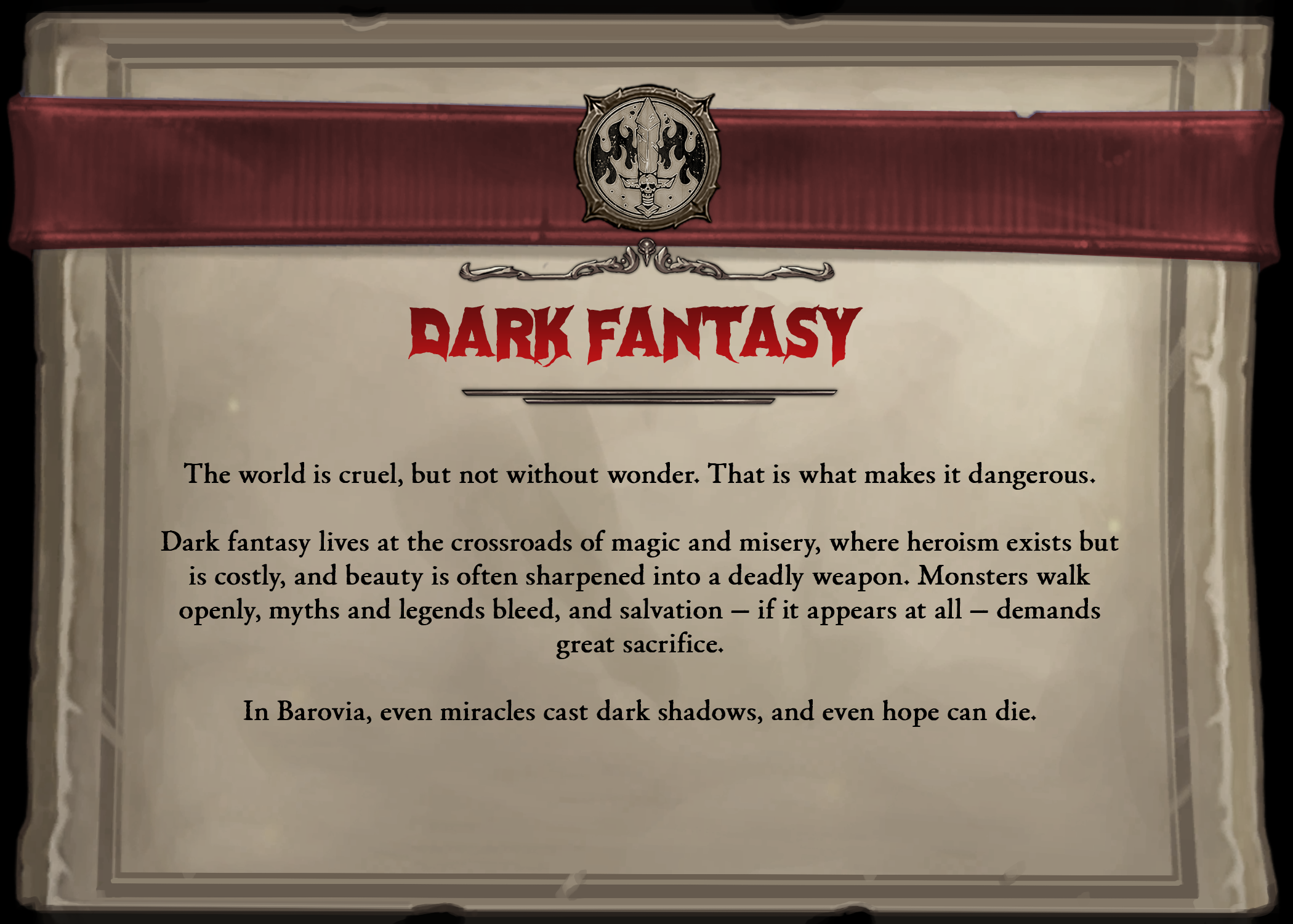
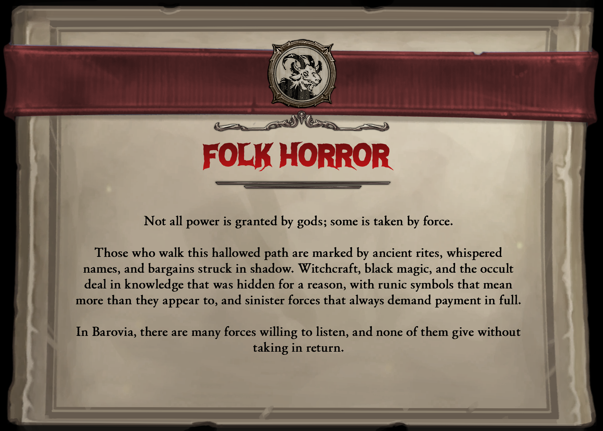
Icons sourced from Van Richten’s Guide to Ravenloft (© Wizards of the Coast). Used here for portfolio demonstration purposes only. All rights belong to their respective owners.
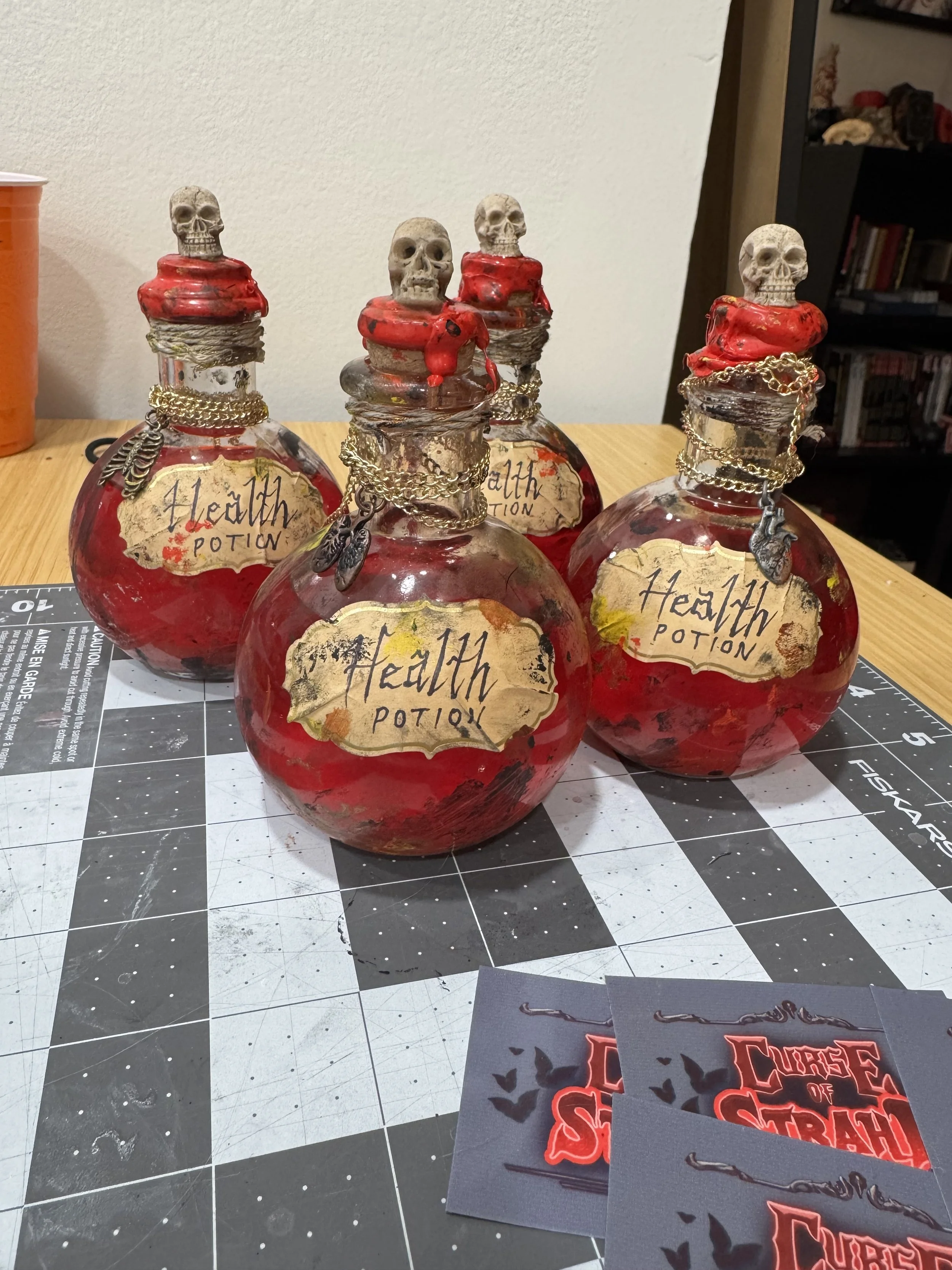
Health Potion Props
To deepen player immersion, I designed and fabricated interactive Health Potion props using glass bottles filled with drinkable red shimmer. Each bottle was hand-painted and aged with layered ink and tea staining to achieve a convincingly weathered, in-world aesthetic.
Custom labels were heat-adhered to the glass and hand-lettered, while metal charms, chains, and twine detailing reinforced the gothic fantasy tone. Corks were dipped in wax to echo historical preservation methods and enhance tactile authenticity.
Beyond their visual role, the props functioned as reusable gameplay mechanics: each potion contained eight consumable “uses,” physically represented through sips. Once depleted, the bottles transitioned into refillable in-game items, extending their narrative and mechanical value.