Project Scope
Graphic Design
Illustration
Printing
Role
Independent Designer
Timeline
3 days
This project focused on designing personalized spell cards for Dungeons & Dragons, intended to function as quick-reference tools during gameplay. Each card balances a high density of information with clear hierarchy, allowing players to locate key details at a glance.
The layout was carefully structured to maintain legibility at a small scale while preserving space for illustrative elements along the margins, giving each card a distinct visual identity. Special attention was given to typography, contrast, and print considerations to ensure the cards remain readable and effective in physical use.
Deliverables included:
✅ A full set of printed, double-sided spell cards with custom illustrations
✅ A reusable card template for future spell card sets

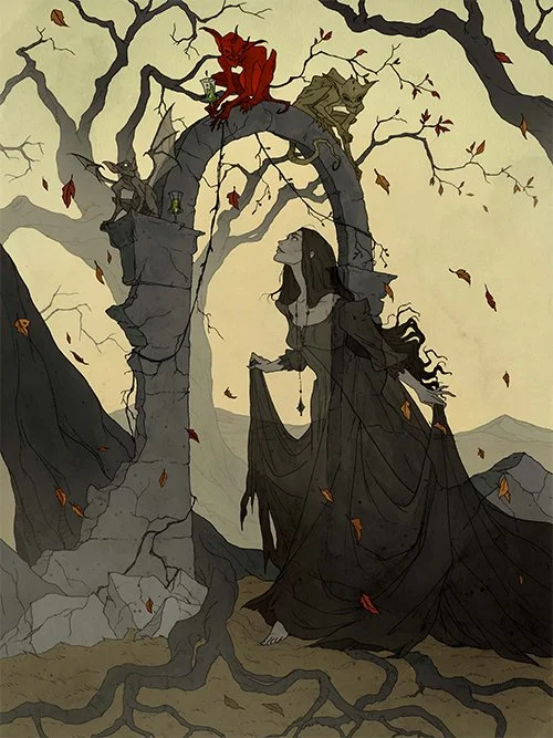
Mood Board
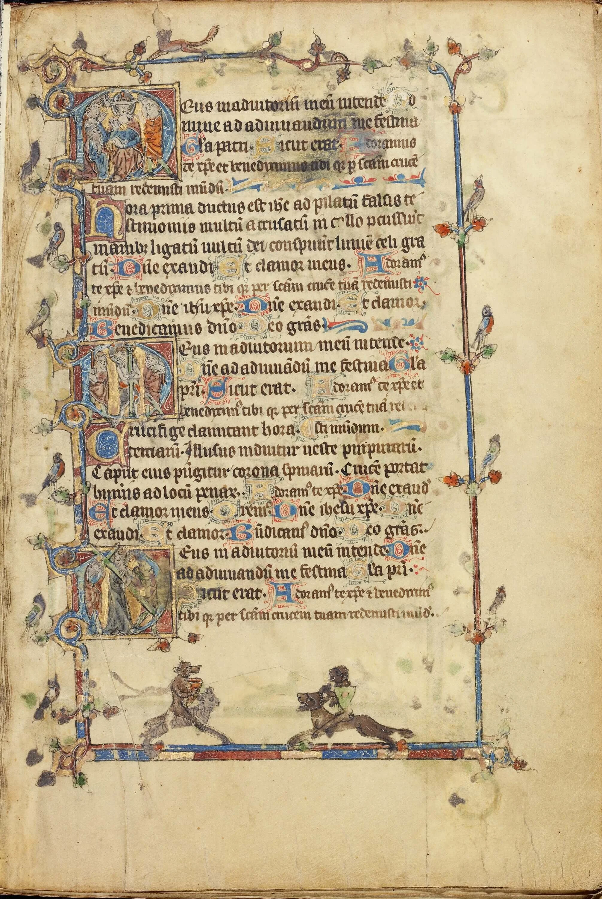
The primary inspiration for the cards came from medieval marginalia, which often balances dense text with playful or symbolic illustrations in the margins. Like spell cards, marginalia communicates information visually alongside written content, creating a small, self-contained layout where imagery augments comprehension and engagement. This approach informed the overall layout and decorative elements of the cards.
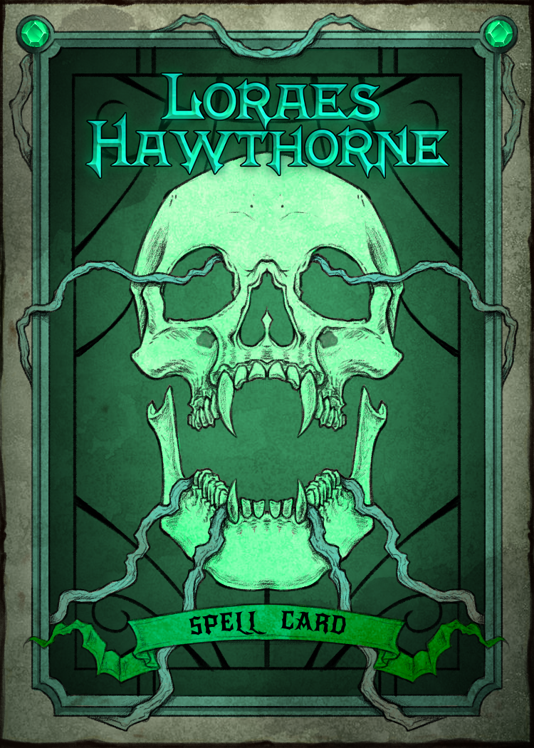
Because the card set was designed for a character in a gothic setting, I explored gothic illustration styles and incorporated skull motifs to reflect that tone. The character’s defining color, a sickly green, served as the foundation for a palette of complementary variants, carefully chosen to maintain visual cohesion and legibility when printed.
Card Layout
To begin, I mapped all the possible data points for a Dungeons & Dragons spell and created a guide layout in Photoshop. Each guide and element was color-coded to stay organized while determining hierarchy, size, and placement. I also used abbreviations or symbols where appropriate to condense information without losing clarity.
Next, I designed a decorative border within the outer margins to allow for printing and bleed. Using Photoshop’s symmetry tool, I maintained balance and efficiency, while thick outlines, heavy shading, and careful spacing ensured the illustrations remained readable at a small scale and avoided distracting tangents.
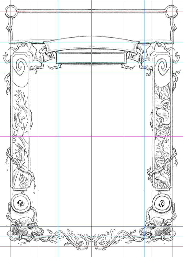
An in-progress version of the design with guides to inform sizing and spacing.
Spell Card Design
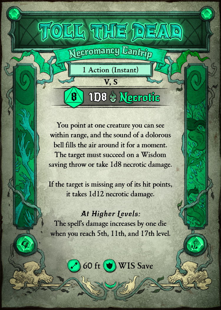
Spells can contain a large amount of data, so the card was designed to present that information clearly within a limited space, using visual hierarchy and shorthand to reduce cognitive load. Key details are emphasized through typography, with important terms in bold for quick scanning. Custom iconography supports rapid recognition: a dice icon indicates required rolls, while hand-drawn symbols along the bottom edge communicate range, saving throws, and other shorthand information.
This particular card was created for a druid character centered on themes of duality (life and death, growth and decay, etc). The visual language reflects this through a mix of organic and macabre elements, including vines, floral motifs, bones, and druidic symbols. A sickly green color palette anchors the design while maintaining enough contrast to keep all text legible and the card crisp in print.
The composition subtly divides opposing forces: one side suggests life, with healthy foliage and a stained-glass panel depicting flowers and leaves, while the other represents decay, featuring withered vines and skeletal, grasping hands. All illustrative elements were hand-drawn with careful attention to spacing and balance, enhancing the design without interfering with readability.
The front (left) and back (right) of the final design.