Project Scope
Logo Design
Illustration
Printing
Role
Independent Designer
Timeline
2 weeks
This freelance commission involved designing a distinctive logo and business card to promote a tarot reading business—Goat Tarot—at Imagine Music Festival in Atlanta, GA. The goal was to create a visually striking design that would stand out in a busy festival environment while clearly communicating the mystical tone of the client’s services. The final design was prepared for print and produced as two runs of 1,000 business cards for distribution to potential customers during the event.
Deliverables included:
✅ A vector-based logo that can be used for advertising and marketing purposes
✅ A set of printed business cards for a music festival vendor
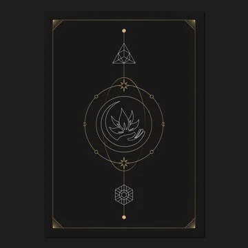
This arrangement of cards is called a spread. (This one is purely for inspiration purposes.)
Mood Board
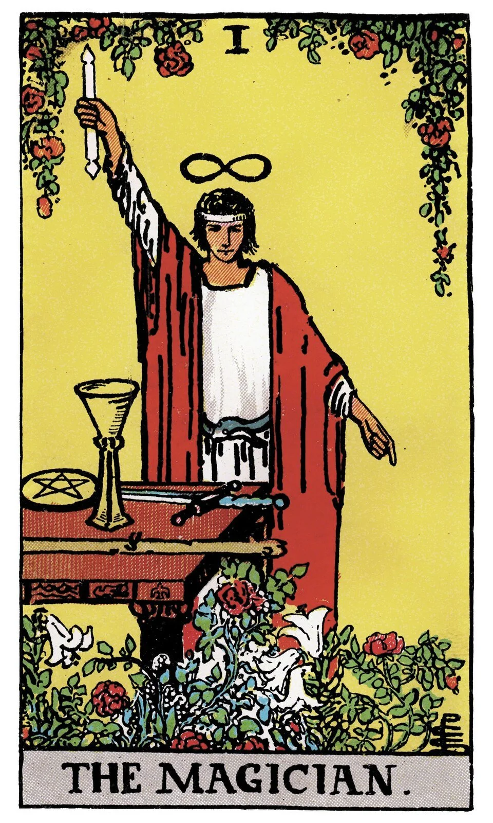
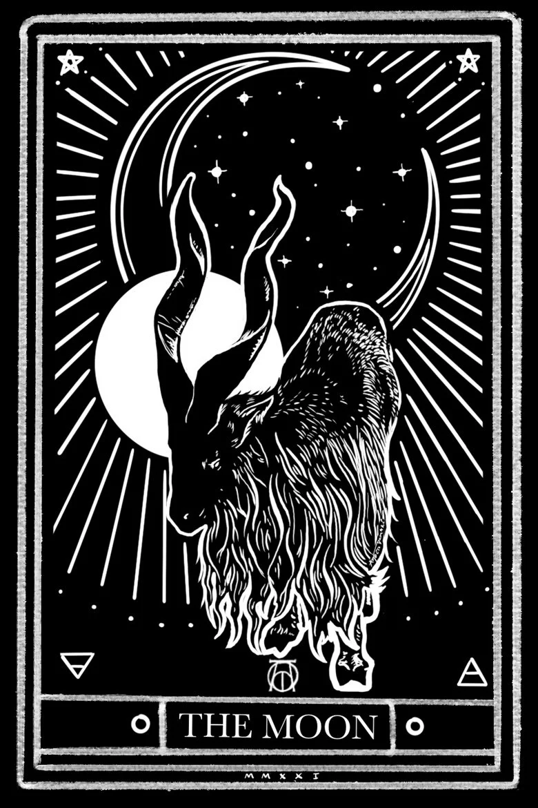
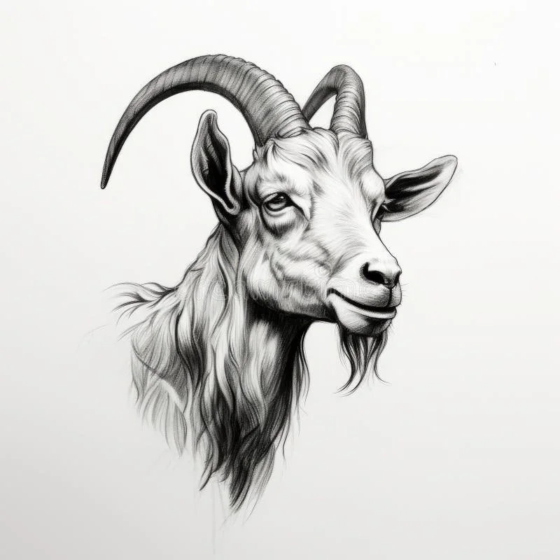
To establish a clear visual direction for the project, I studied classic tarot deck designs and gathered reference imagery of goats to inform the development of the central illustrated logo. Traditional tarot cards are defined by strong framing devices, bold outlines, and symbolic imagery that remains readable at a small scale. These characteristics aligned well with the design goals of the business card, which needed to communicate its theme quickly while leaving a memorable visual impression.
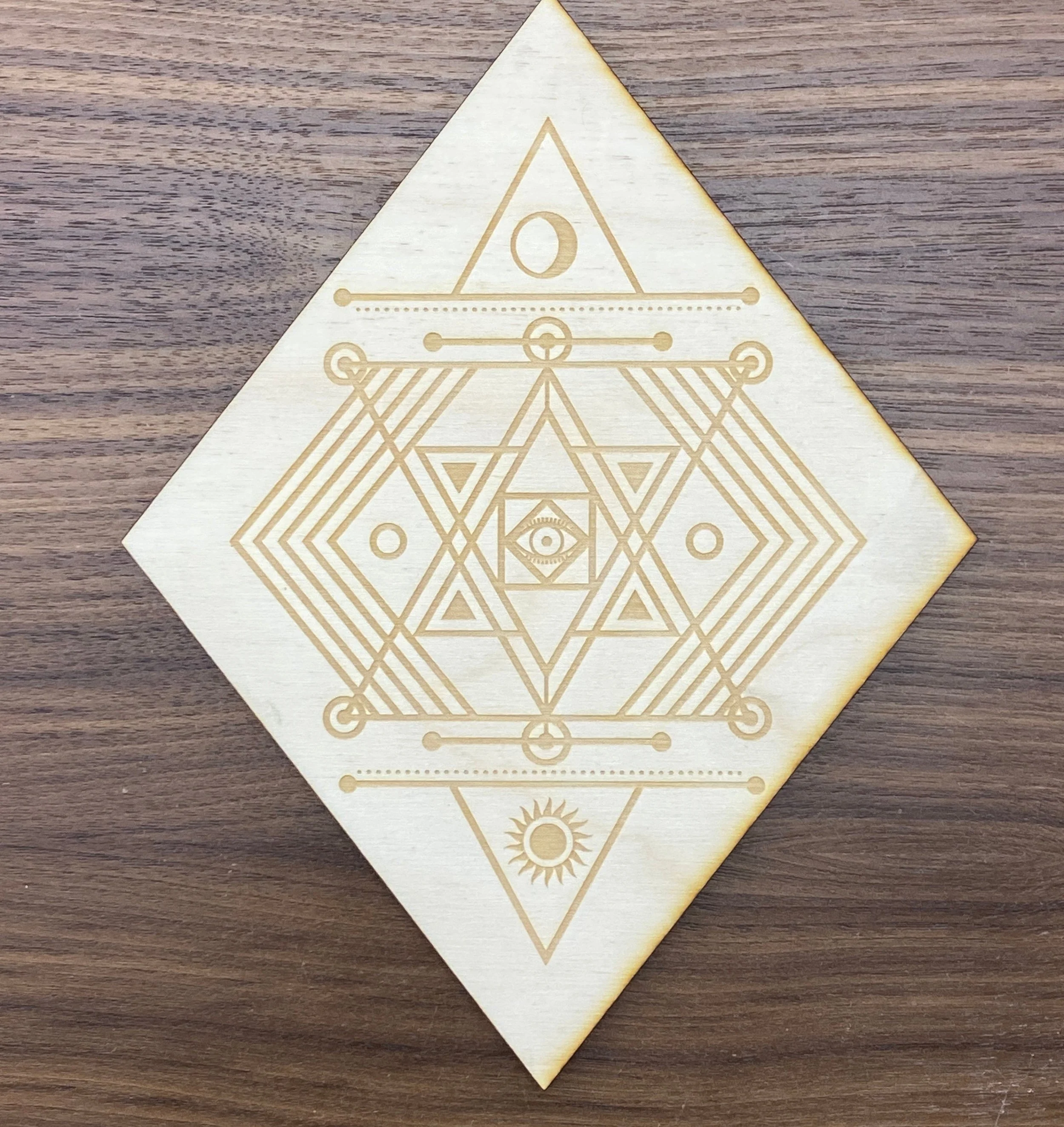
The client also requested the inclusion of visual motifs inspired by alchemy and sacred geometry. These traditions often rely on symmetrical arrangements and carefully balanced abstract forms, which became a useful structural framework for organizing the layout. Geometric shapes and symbolic markers were integrated into the composition to guide the hierarchy of information while reinforcing the mystical tone of the brand.
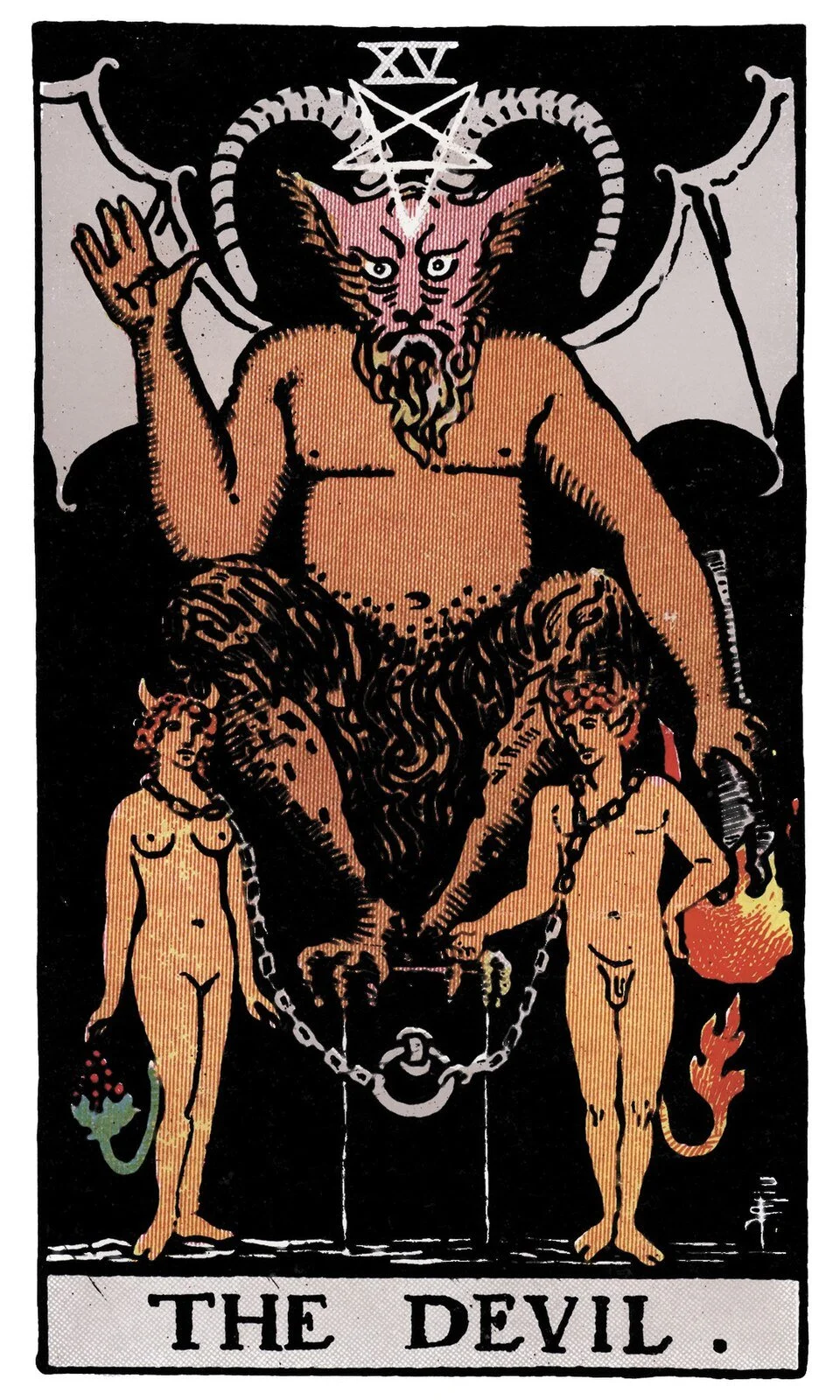
Because the music festival where the card would be distributed takes place in the fall, the color palette was built around a muted orange reminiscent of autumn tones. The decision was also influenced by the imagery of The Devil (a tarot archetype traditionally associated with a specific goat-like figure). To complement this palette, the black tones were slightly lifted to produce a softened, aged look, helping the design evoke the feeling of a well-worn tarot card while maintaining strong visual contrast for print.
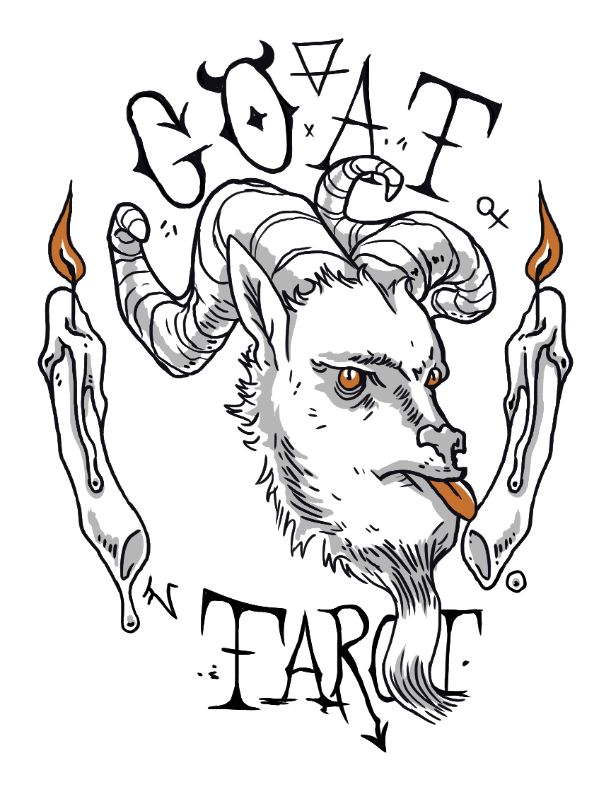
Logo Design
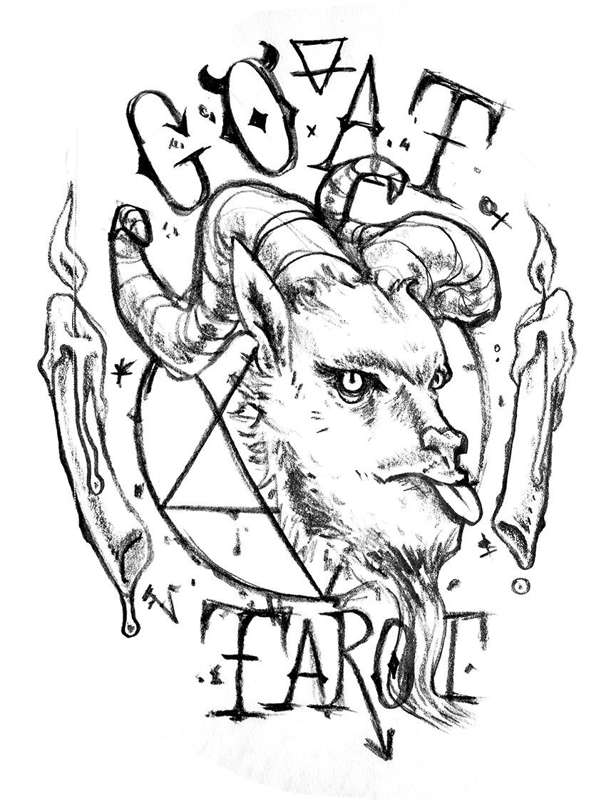
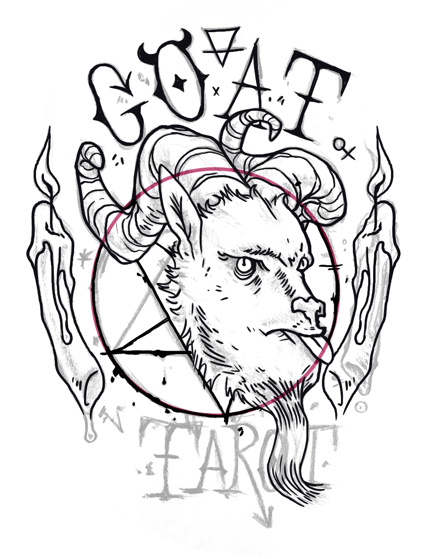
The logo began as a hand-drawn concept sketch I built around the client’s request for a prominent goat head as the central symbol. To reinforce the mystical tone of the brand, the illustration incorporates occult-inspired elements arranged to create a cohesive visual structure. The circular geometry implied by the faint pentagram helps guide the overall silhouette, giving the composition a subtle radial balance while keeping the goat head as the dominant focal point.
During the sketch phase, particular attention was given to line intersections, spacing, and tangents to ensure the layered elements felt intentional rather than crowded. This careful placement helps maintain visual clarity while allowing multiple symbolic elements to coexist within a relatively compact mark.
The final logo was then translated into a vector format in Adobe Illustrator. Converting the illustration to vector allowed the linework to remain sharp and scalable across a variety of applications, from small printed materials to larger signage. Simplifying certain lines and refining the stroke weight during the vectorization process also helped preserve the character of the original drawing while ensuring the mark reproduces cleanly across different sizes.
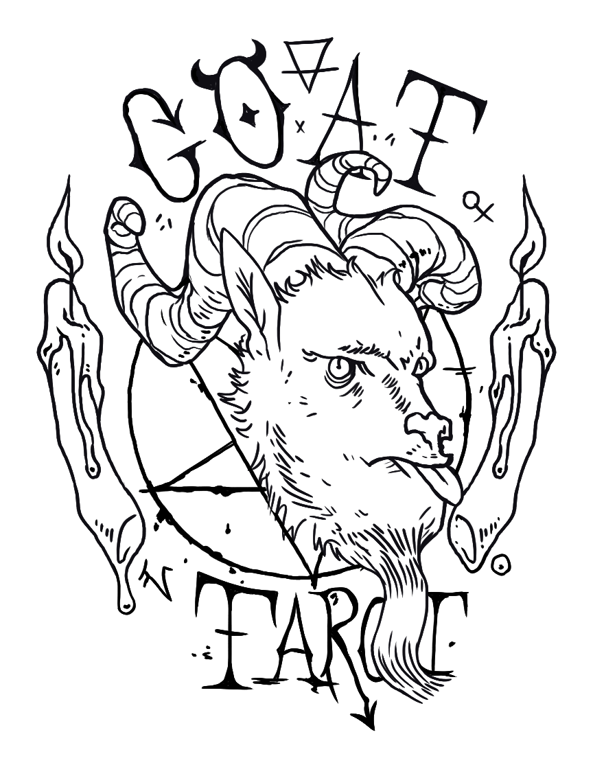
The original concept sketch (left), an in-progress version of the translated design (middle), and the final design (right).
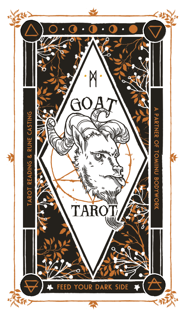
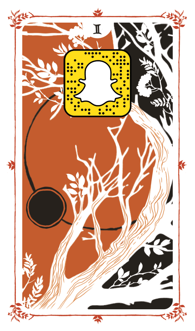
The front and back of the final design.
Business Card Design
The illustrated goat logo serves as the visual anchor of the business card, establishing a clear focal point that guides the rest of the composition. From this central element, the layout expands outward using a system of geometric framing devices and illustrated botanical textures. Interlocking diamonds, circles, and vertical bars create a structured visual hierarchy, while hand-drawn branches and leaves soften the geometry and reinforce the mystical, nature-inspired identity of the brand.
Line weight and contrast were carefully balanced to maintain clarity at a small print scale. Subtle shading within the illustrated logo adds depth without introducing unnecessary complexity, while the original hand-lettered text was replaced with a heavier typeface to improve legibility and typographic consistency. The restrained color palette—built from warm ochre, black, and off-white—creates strong contrast for readability while also keeping printing costs efficient.
Production considerations informed several layout decisions. A generous bleed ensures the border artwork remains intact even if the card shifts slightly during trimming, and the simplified color structure prevents fine details from being lost in print.
The reverse side incorporates the client’s Snapcode as a functional web link, allowing customers to easily access her social media. Concentric circular elements and branching forms establish directional flow across the card, creating a subtle visual rhythm that moves the viewer’s eye through the composition while maintaining the same illustrated botanical language introduced on the front.