Project Scope
Poster Design
Graphic Design
Printing
Role
Independent Designer
Timeline
3 days
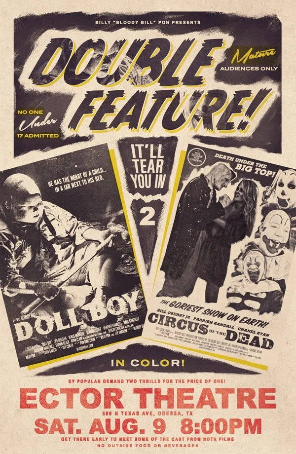
This was a project to design a movie poster and other printed materials to promote a horror movie night I helped host in October 2025. I designed the poster as a double-feature flyer for the films we watched: Weapons and The Empty Man. The poster was intended to function as both a digital invitation and promotional graphic that could be shared via social media and e-invite apps. It can also easily translate into print formats such as posters, brochures, or event marketing materials.
Deliverables included:
✅ A movie poster, suitable for digital or printing
✅ A custom, hand-drawn logo
✅ A printable drinking game rules handout
✅ Signage, place cards, and labels for refreshments
Inspiration
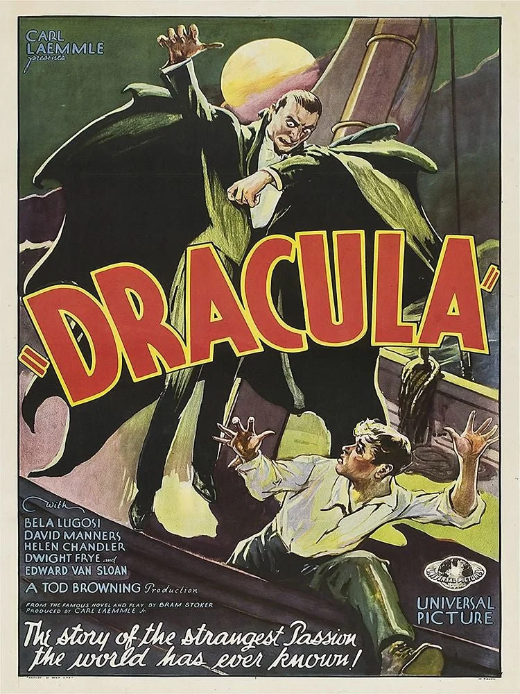
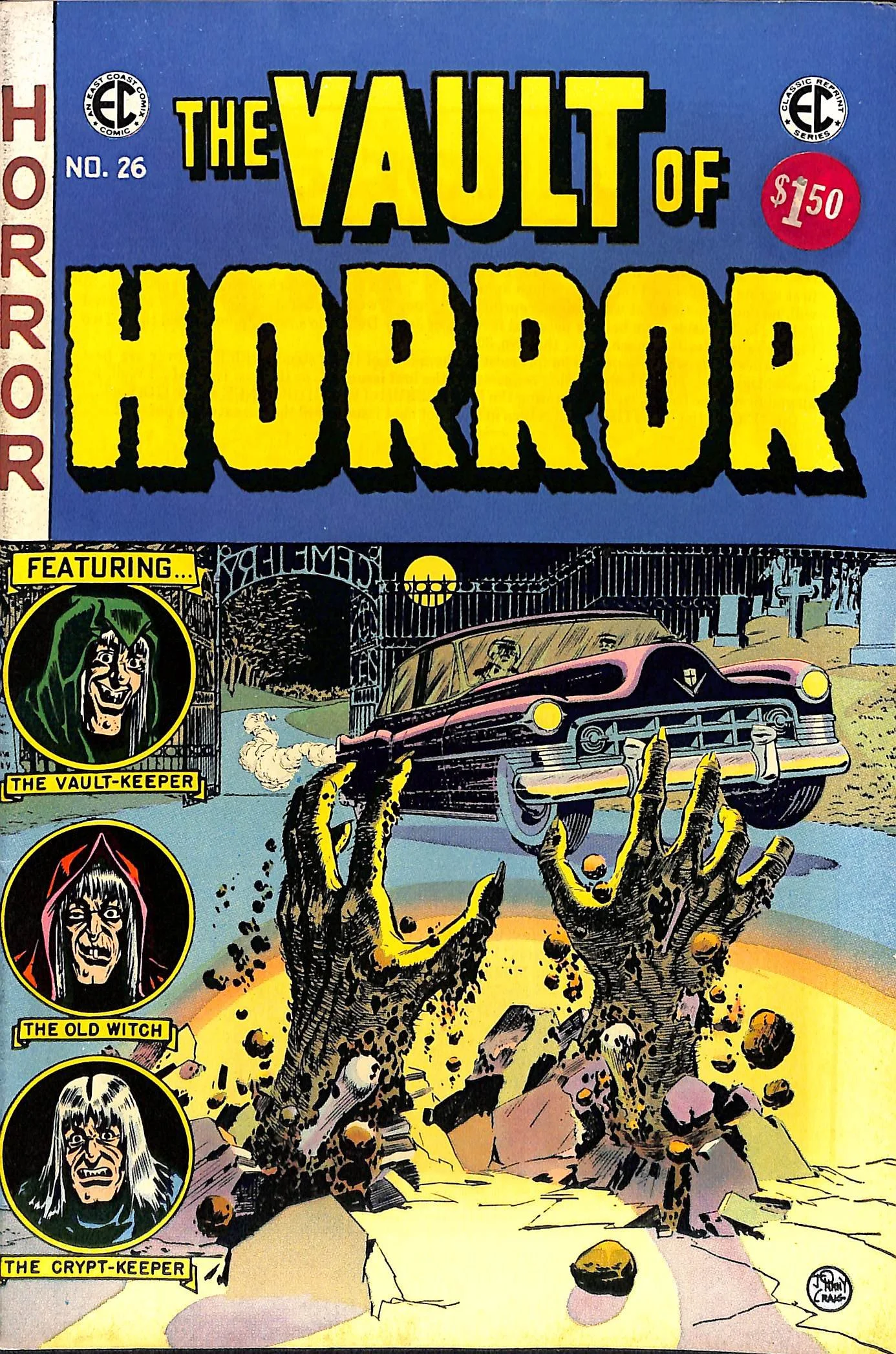
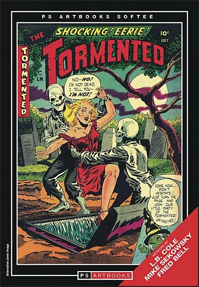
The Rocky Horror poster on the left served as an initial visual reference for the project and helped establish the overall direction for the design. From there, I collected images of classic horror posters and vintage comic books, focusing on how they balance their chaotic compositions with bold, eye-catching typography and striking iconography.
To maintain stylistic consistency and preserve brand recognition, I incorporated official marketing posters for the two films that shared a similar visual language. Using their existing artwork allowed the composition to remain immediately recognizable while supporting the overall vintage horror aesthetic.
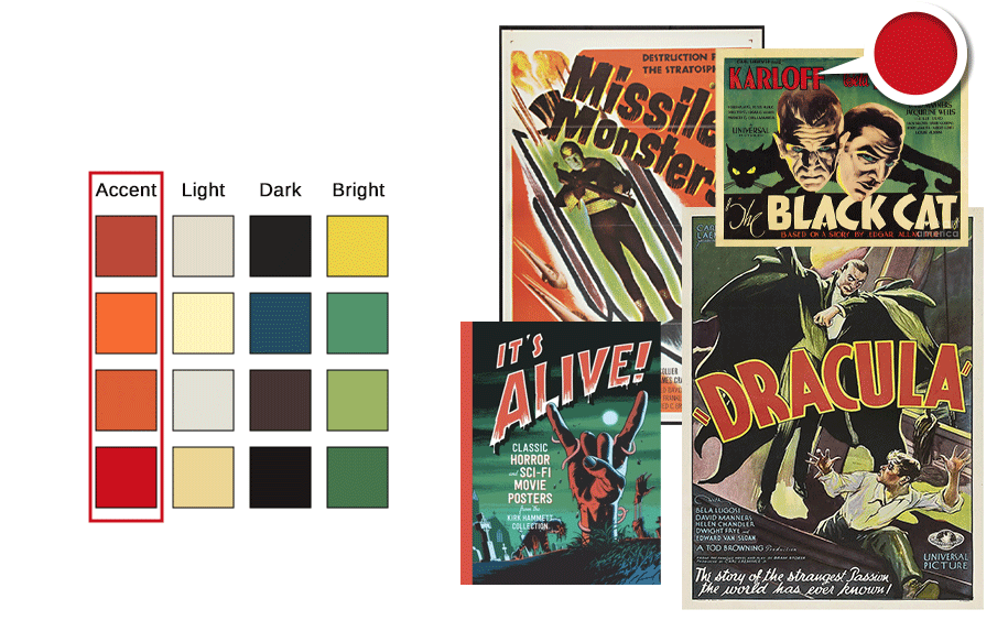
Color Studies
As I began sampling colors from my reference images, I noticed most of the retro horror movie posters I came across used the same Tetradic color scheme in each composition:
A primary accent color, like red or orange
A light, neutral base for the background
A dark, cool shade to boost depth and shadows
And a bright hue (usually green or yellow) for contrast
This simple combination uses four colors of two complementary pairs to define strong contrast between values and establish a visual hierarchy by assigning specific values to each element based on their significance—the most important information receives the accent color, secondary information uses the light or dark color, and the bright color is used sparingly to boost contrast against the accent.
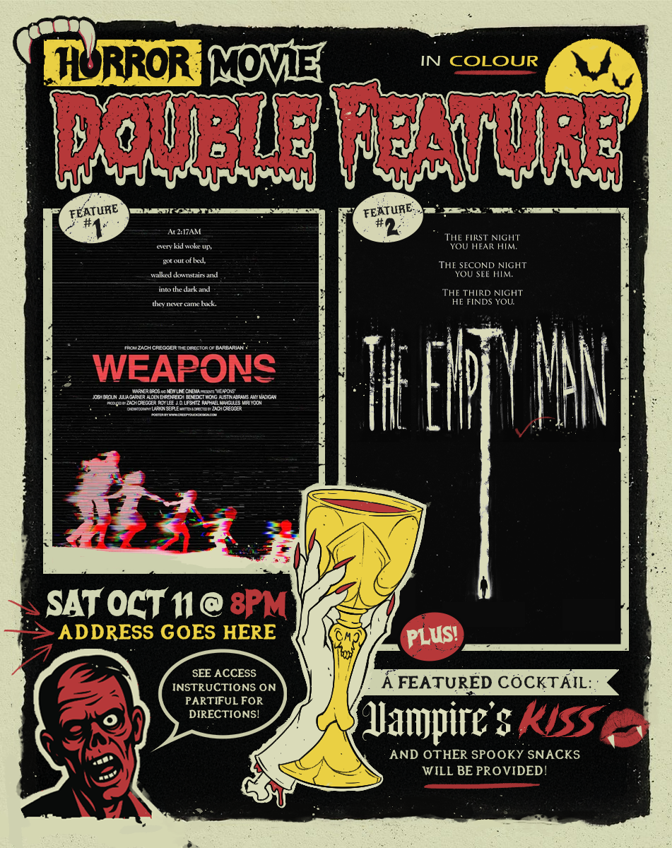
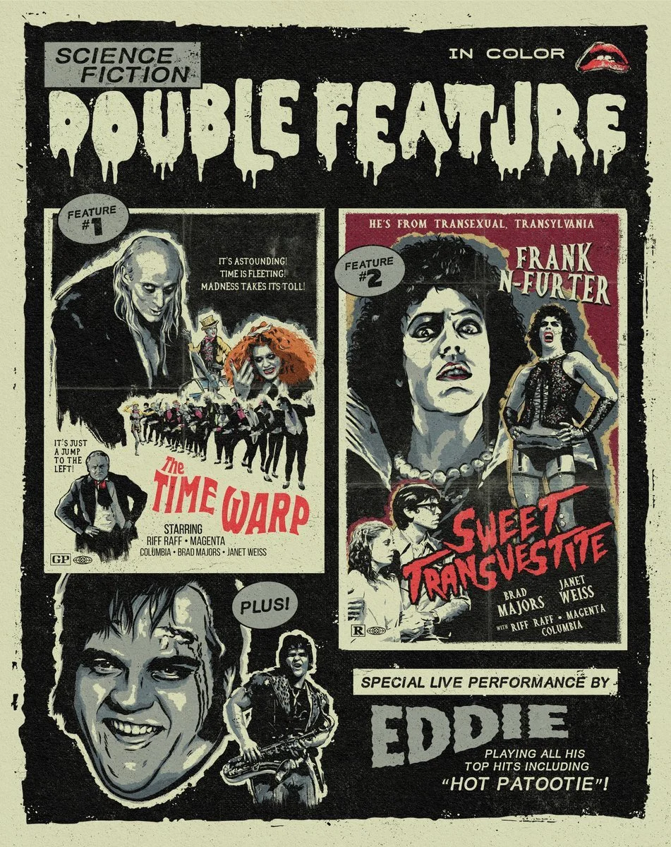
The original poster I referenced (left) and my final design (right). Film posters are used here for portfolio demonstration purposes only. All rights belong to their respective owners.
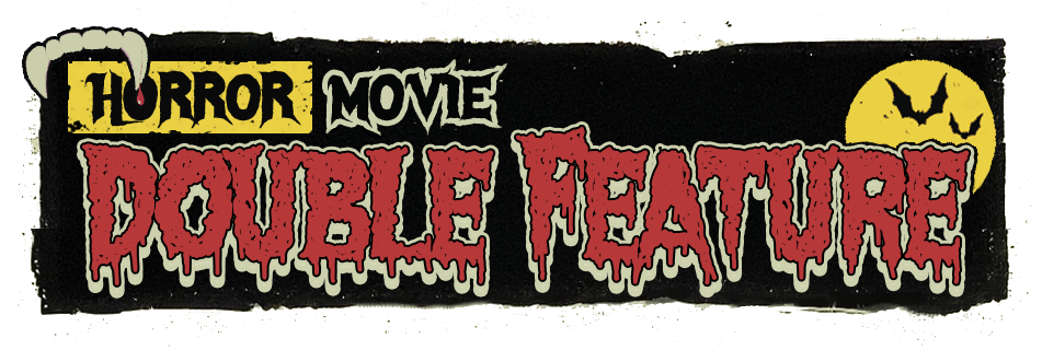
Poster Design
The restricted color palette required careful compositional planning, as elements sharing the same color could easily blend together and lose definition. Using the reference layout as a foundation, I assembled graphic elements in layered arrangements to create depth and visual interest. Particular attention was given to consistent spacing and deliberate overlaps, treating the composition almost like a puzzle where each piece needed to fit precisely within the limited palette.
To capture the chaotic energy of mid-20th-century exploitation and grindhouse posters, I selected a range of grungy, distorted, and dripping typefaces. These expressive letterforms reinforce the dramatic, eye-catching aesthetic characteristic of the era.
I also consolidated the colors from the original reference image, simplifying the palette to maintain visual cohesion while reducing noise and improving print clarity.
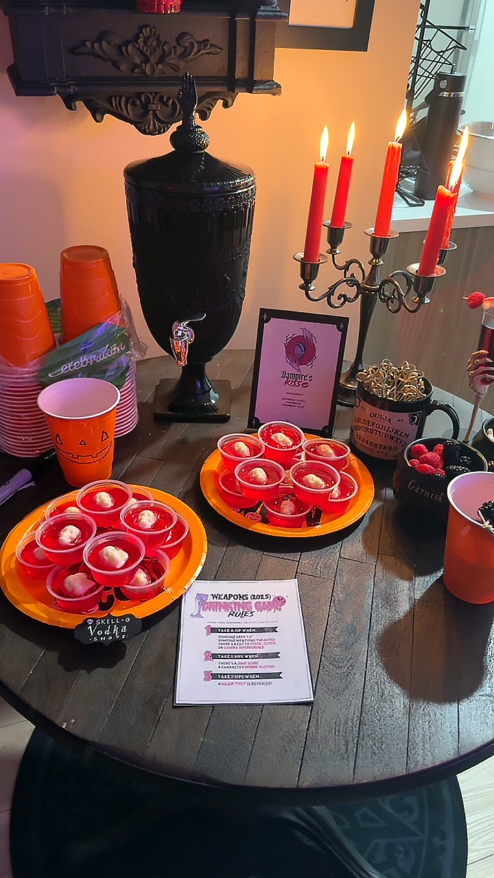
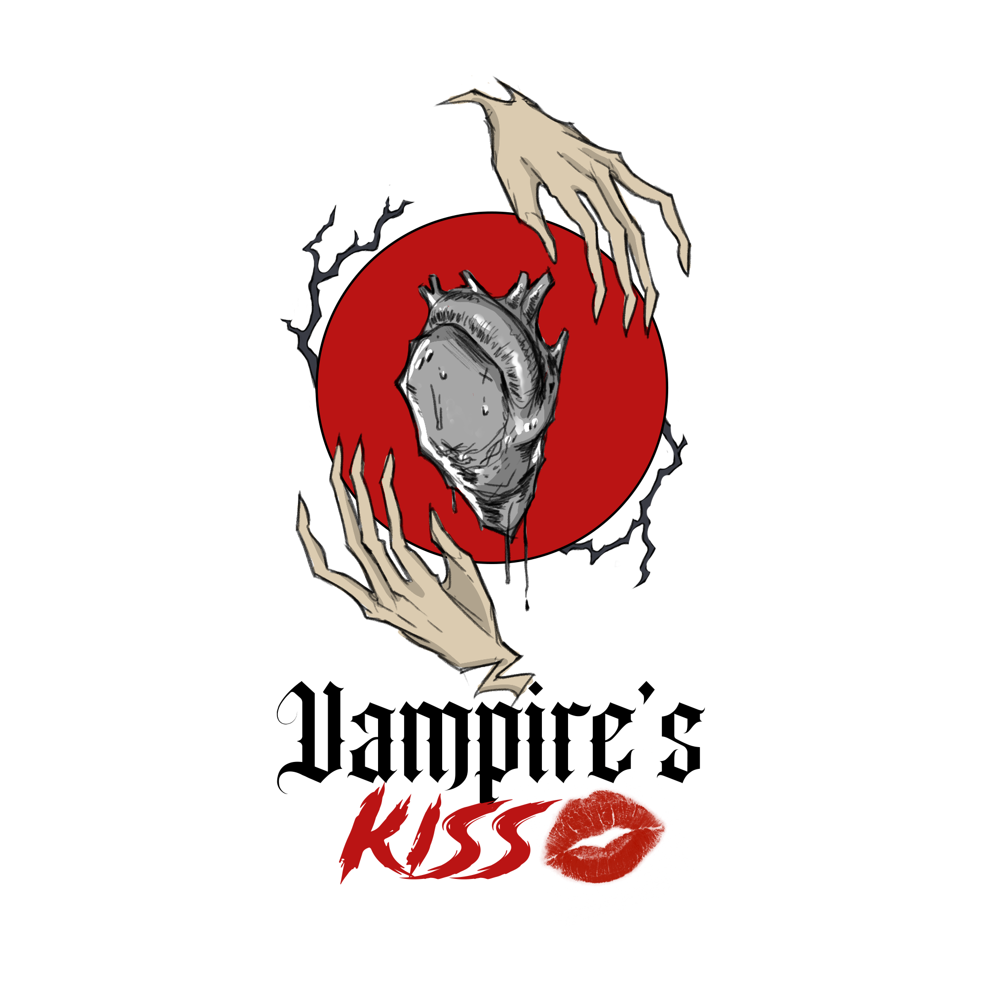
Vampire’s Kiss Logo
The event featured a signature cocktail called the Vampire’s Kiss to help set the spooky mood, so I designed a simple illustrated logo to represent the drink and display near the refreshments at the party.
Centered around a crimson full moon and a dripping heart, a pair of symmetrical, covetous hands and twisted branches forms a well-balanced, clean design that evokes the possessive, bloodthirsty nature of the drink’s namesake.
A printed version of this logo appeared on a printed display sign next to the cocktail station.
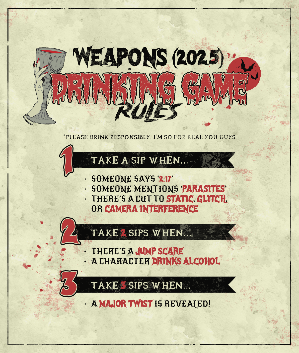
Weapons Drinking Game Rules
In addition to the featured cocktail of the evening, a special drinking game based on Weapons demanded the creation of this printable handout that explains the rules in a clever infographic.
I reused some of the elements from the movie poster in order to keep a consistent visual identity between all materials, and broke the rules down into three structured sections. Keeping everything compact and aligned to center, with wide margins on all sides, the information is organized into a compact format that is easy to parse at a glance (or while inebriated).
Printed versions of this rules sheet were distributed to party guests, as well as a QR link to a digital version.
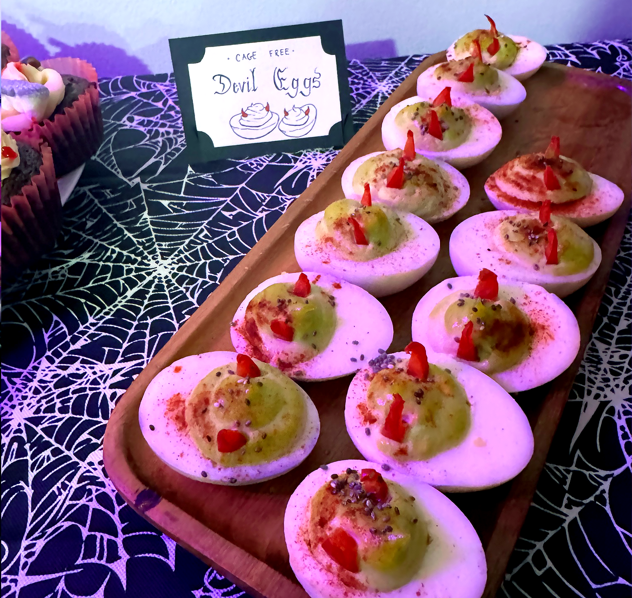
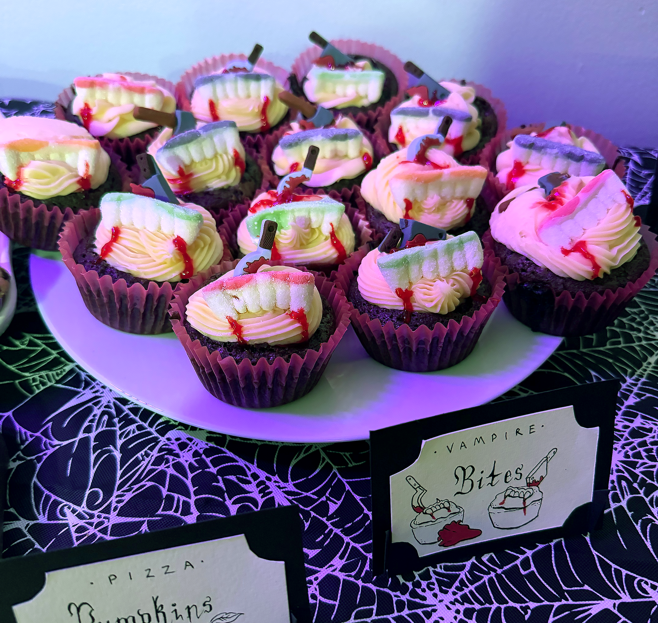
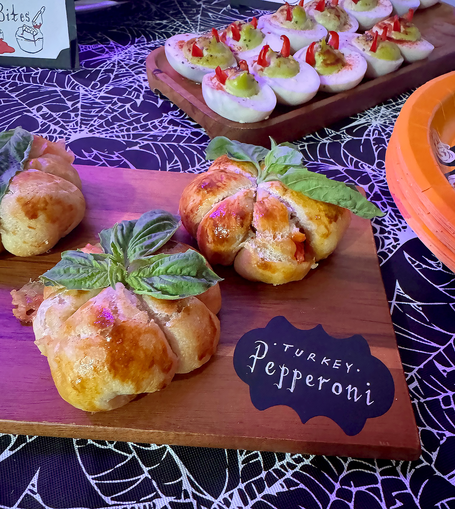
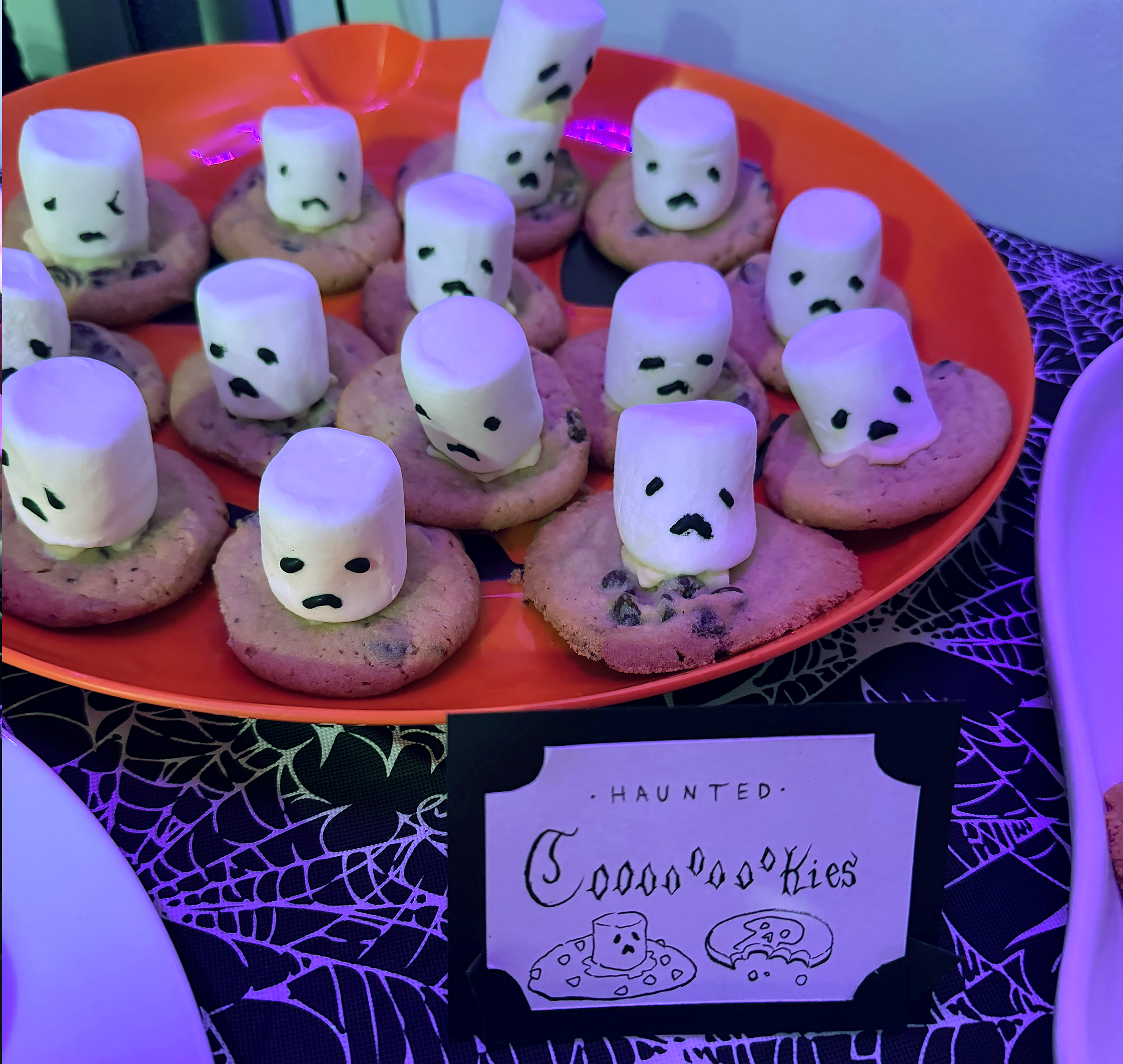
Snack Table Place Cards
The Vampire’s Kiss cocktail wasn’t the only refreshment served at the party—there was also a snack station featuring a variety of spooky-themed dishes and treats which I designed handmade labels and place cards for. Pizza pumpkins, devil eggs, vampire brownie bites, skell-o vodka shots, and haunted coOoOokies were just a few among the food options, each recipe chosen for their visually unique, creative take on classic party snacks with a Halloween twist!